Styling CSS Labels
In addition to adding functionality to your forms, labels can greatly increase readability and play a part in laying out form controls. To illustrate, let’s take a form that accepts user info, with the following HTML markup:
<h2>Styling Form Controls</h2>
<form id="register" name="register" method="post" action="noaction.html">
  <fieldset>
    <p>
      <label for="name">Your Full Name</label>
        <input type="text" name="name" id="name">
    </p>
    <p>
      <label for="email">Email</label>
        <input type="text" name="email" id="email">

    </p>
    <p>
      <label for="phone">Phone</label>
        <input type="text" name="phone" id="phone">

    </p>
    <p>
      <button name="button" id="button">Submit</button>
    </p>
  </fieldset>
</form>
That produces this bare-bones form:
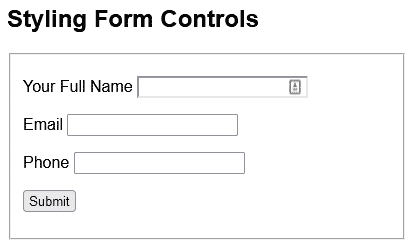
Before we get to the labels, let’s apply a bit of styling to the form and input controls:
* {
  font-family: Arial, Helvetica, sans-serif;
}

#register {
  width: 400px;
}

input {
  padding: 3px;
  box-shadow: 3px 3px 5px grey;
  font-size: 14px;
  font-weight: 600;
  width: 300px;
}
That first rule selects everything on the page using the asterisk (*) wildcard character. Hence, it applies the specified font-family to the entire page.
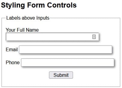
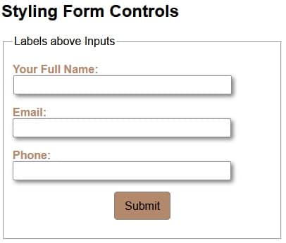
With the above styles in place, you’ll notice that the label positioning becomes haphazard, in that some appear above the input, while others are aligned to the left:
We can position all labels above their associated controls using the following CSS:
label {
  color: #B4886B;
  font-weight: bold;
  display: block;
}
label:after { content: ": " }
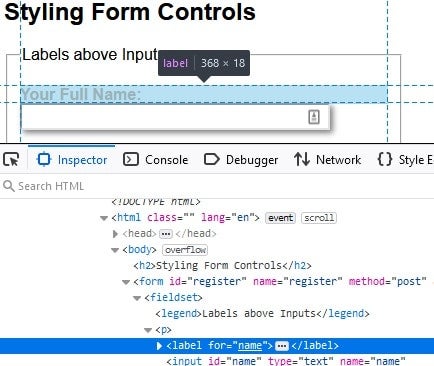
The key attribute is “display: block;”. Assigning a value of “block” to the display property makes the element behave as a block element, such as a <p>. Hence, it starts on a new line, and takes up the entire width of the container. We can verify this behavior by inspecting a label with the browser tools:
The “label:after” creates a pseudo-element that is the last child of the selected element. It is often used to add cosmetic content to an element with the content property. In our case, we can use it to append a colon (:) after each label.
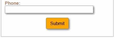
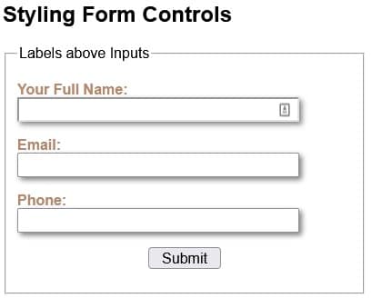
Here is the form with all CSS applied:
Aligning Labels to the Left of Inputs
Another common layout is to position labels to the left of their associated controls. To do that, we can replace the “display: block;” with two other attributes, i.e. width and float:
label {
  color: #B4886B;
  font-weight: bold;
  width: 130px;
  float: left;

}
label:after { content: ": " }
The width determines how much horizontal space the label “column” takes. The more width is allocated, the further from the controls the labels will be.
Assigning a value of “left” to float positions labels to the left-most edge of their container.
There are a couple of other considerations when positioning labels to the left of their associated controls:
- Make sure that the form’s width is great enough to accommodate both the labels and fields on one line. Otherwise, they may wrap.
- You may want to assign a value to the margin-top so that there is a bit of vertical space between form elements. Without that, they can look like a stack of slices in a loaf of bread!
We’ll deal with both those issues by adding the following CSS:
#register2 {
  width: 500px;
}

#register2 p {
  margin-top: 20px;
}
Here is the updated form with labels to the left of input fields:

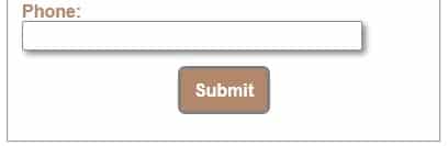
Styling Buttons in CSS
Without additional CSS styling, HTML buttons are rendered as gray rectangular boxes with black text. Not very interesting. The good news is that CSS allows us to change virtually every aspect of a button’s appearance and positioning. Case in point, take a look at the following CSS rule:
#button {
  padding: 10px;
  border: 1px solid gray;
  background-color:#B4886B;
  border-radius: 5px;
  font: inherit;
}
Now the button’s appearance matches the color palette of the rest of the form:
Centering Form Elements
One difference between the Submit button and the rest of the form is that it is horizontally centered. There are a number of ways to center an element within its container; one way is to give the element a width (either absolute or relative) and then set the margin-left and margin-right attributes to “auto”. Here is the code that centers the Submit button:
  display: block;
  margin-left: auto;
  margin-right: auto;
  width: 80px;
Responding to Focus and Hover Events in CSS
You might be under the impression that you need JavaScript in order to make a form interactive. Not true! Thanks to the CSS :focus and :hover pseudo-classes, you can change an element’s appearance in response to user actions. As you may have guessed, the :focus pseudo-class governs an element’s appearance when it obtains the focus. Likewise, the :hover pseudo-class sets an element’s appearance when the mouse cursor traverses over it.
Here is a rule that alters the Submit button’s appearance on focus:
#button:focus {
  outline: 2px solid gray;
  font-weight: bold;
  color: white;
}
This rule kicks in when the mouse cursor is traverses over the Submit button:
#button:hover {
  background-color: orange;
  box-shadow: 3px 3px 5px grey;
}